Where it started
The idea of a new logo and visual identity has been in the works for years. Early on, the plan was simple: focus on shipping the best product and everything else was secondary. A new logo was treated as a nice future milestone, not something urgent.
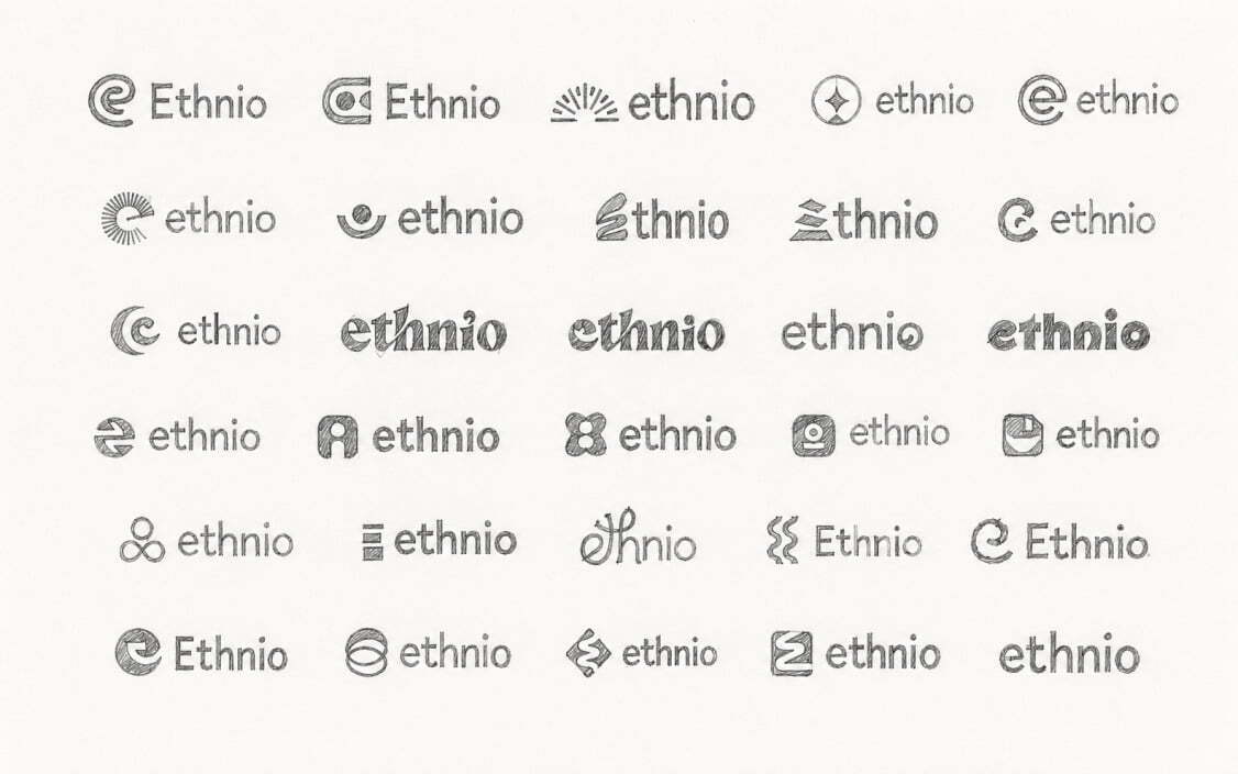
We looked at bringing in outside help and spent a few months going back and forth on that path. Meanwhile, we kept exploring ideas quietly in the background, testing different directions for what the mark could become. Eventually, one of those internal explorations was the one that stuck. It wasn't the plan going in, but it turned out to be the right one.
Why we changed it
The old ring shape worked as a logo, but it didn't do much beyond that.
We wanted a logo that reflects the actual work of recruiting participants and running research, not just a target. Nate BoltCEO, EthnioAs Ethnio grew from a recruiting tool into a platform that covers the full research lifecycle, the logo needed to grow with it. We also wanted something that felt less like a static badge and more like it had direction and movement, something that could represent a process rather than just a name.
What the new logo means: three lines of focus
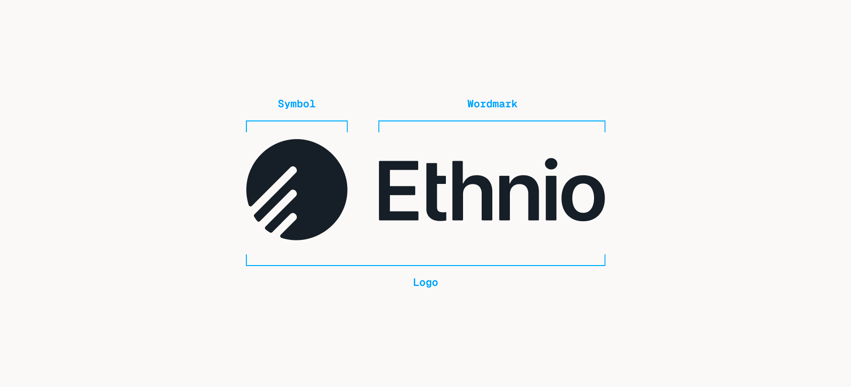
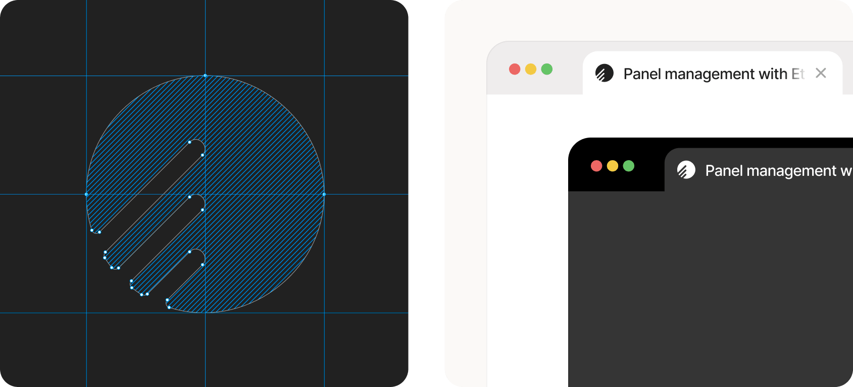
The new mark is built from three diagonal lines inside a circle. Each line stands for a core part of what Ethnio does:
Recruit participants. The first step in any study: finding the right people.
Manage research. Running the study itself, from screening through completion.
Operations. The behind-the-scenes work that keeps everything moving.
The lines sit at an angle instead of stacked flat, which gives the mark a sense of motion. Research isn't one static task, it moves through stages, and the logo now shows that instead of just implying it. Read together, the three lines form a kind of shorthand for the whole product experience, start to finish.
The circle around the lines keeps a visual link to the old mark, so the shift feels like an evolution rather than a clean break. But where the old ring was closed and symmetrical, the new shape is open and directional. It points somewhere.
Identity
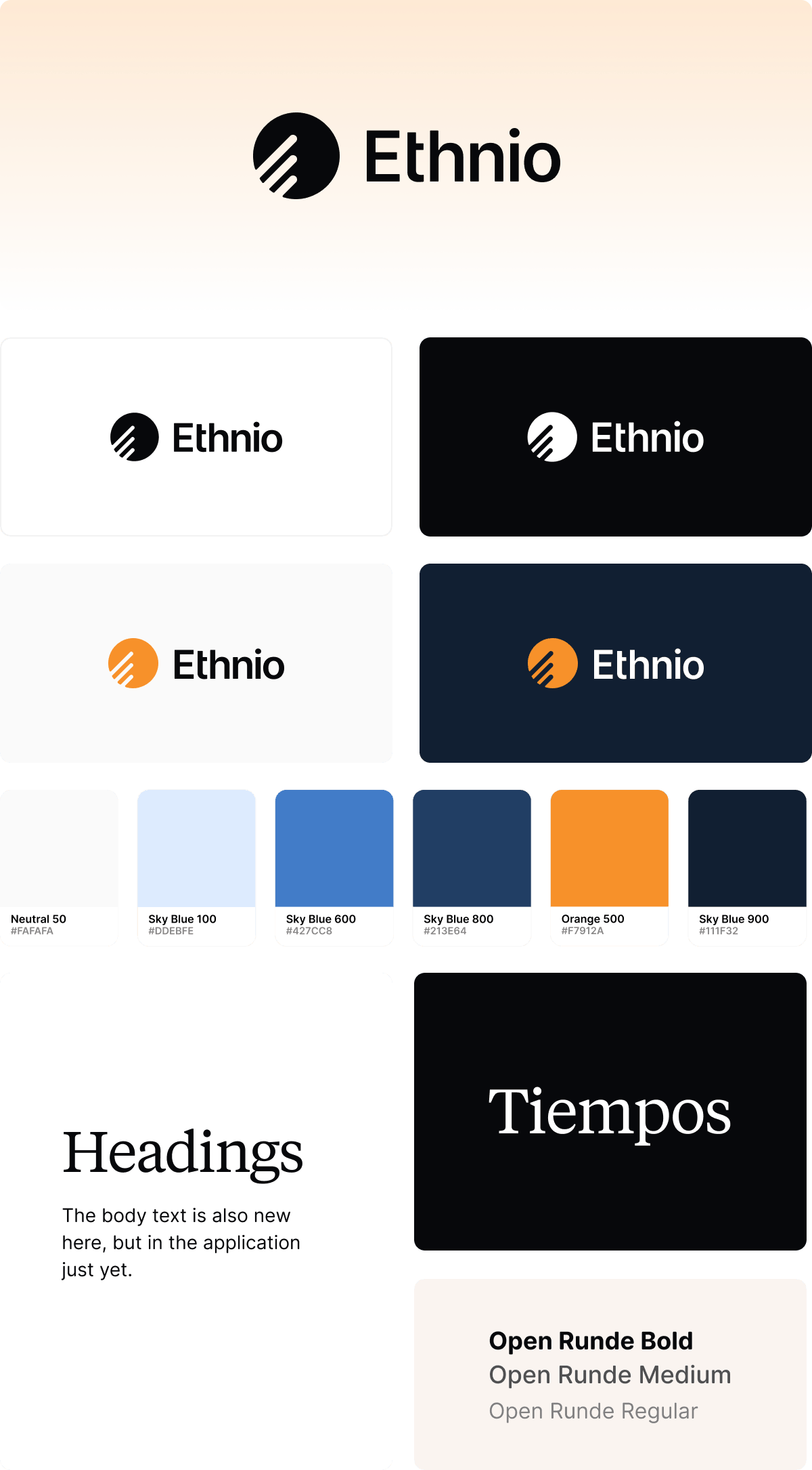
The mark is the centerpiece, but this refresh covers the whole identity around it. Headings now use Tiempos, a serif with real editorial character. It might seem like an unexpected choice for a research platform, but that's part of the point. Research is a craft with history behind it, and a serif carries some of that weight in a way another geometric sans never could. Body text uses Open Runde in our marketing site and help sites, a rounded sans that stays friendly and readable at small sizes.
Color got the same treatment. The palette centers on new colors with a range of lighter tints for backgrounds and surfaces. A deep navy anchors the darker end, and a single yellow shows up sparingly, reserved for moments that deserve attention. The restraint is deliberate. Research tools live inside people's workdays, and we wanted a palette that feels confident without shouting.
The logo itself now works across way more colors than before: light backgrounds, dark backgrounds, single color, and a yellow-on-navy pairing for moments where we want more energy. The old ring only really worked one way. The new mark flexes.
You'll see all of this rolling out now across our invoices, documents, help site, and everywhere else you interact with Ethnio. The application will follow as we bring the new type and color system into the product itself.
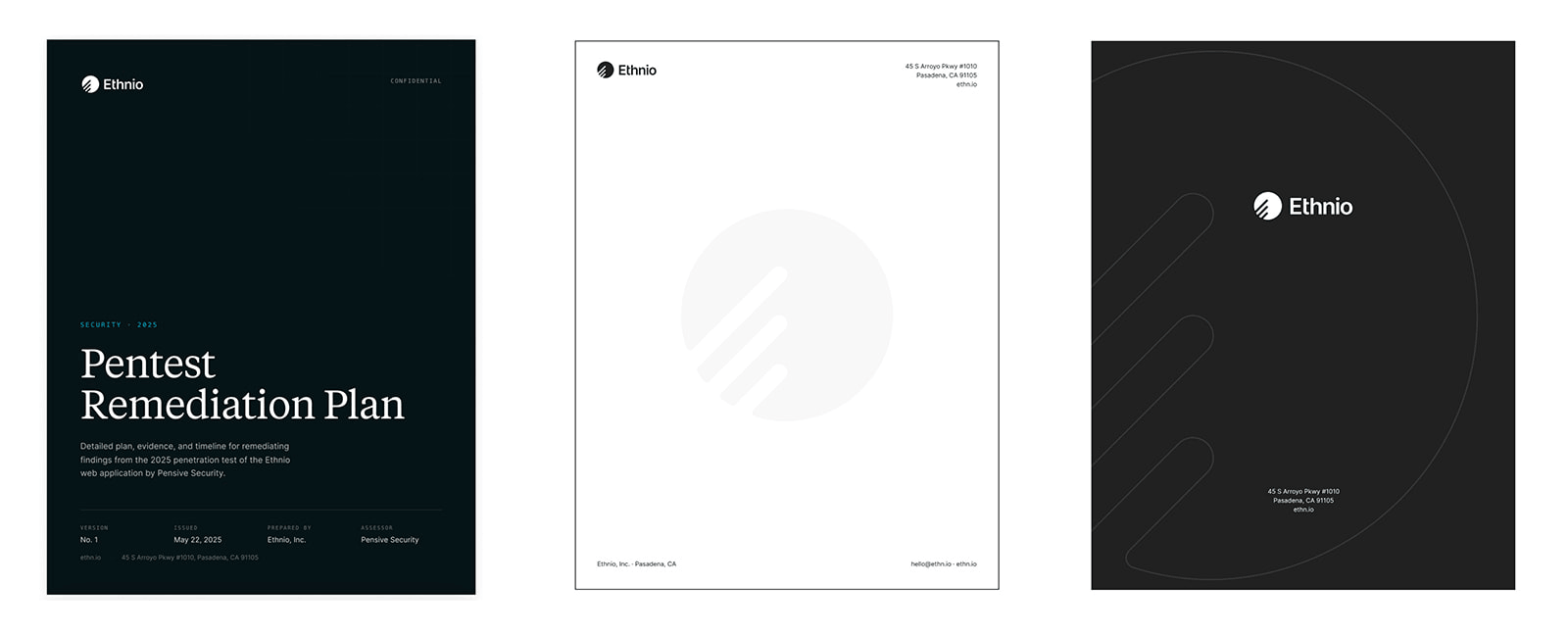
The new Ethnio
After countless rounds of iteration, we landed on an identity that finally feels like us: built around the work of research, and moving the way research and recruit operations actually moves. It honors the original mark while setting the foundation for everything that comes next.
What this means for you
For our current customers, hi, hello 👋, thank you for skimming this far or having your AI skim this far. Nothing about your account or how Ethnio works is changing. You'll see the new mark roll out across invoices, emails, and our help site over the coming weeks. Anything you've branded with your own identity, like intercepts or study links, is completely untouched. If your team keeps vendor records with our logo or email templates, you can grab updated assets from this site.
What's next
The logo is only the first visible piece of a broader refresh, with product updates to follow. For now, we're glad to finally have a mark that looks like where Ethnio is headed, not just where it started.