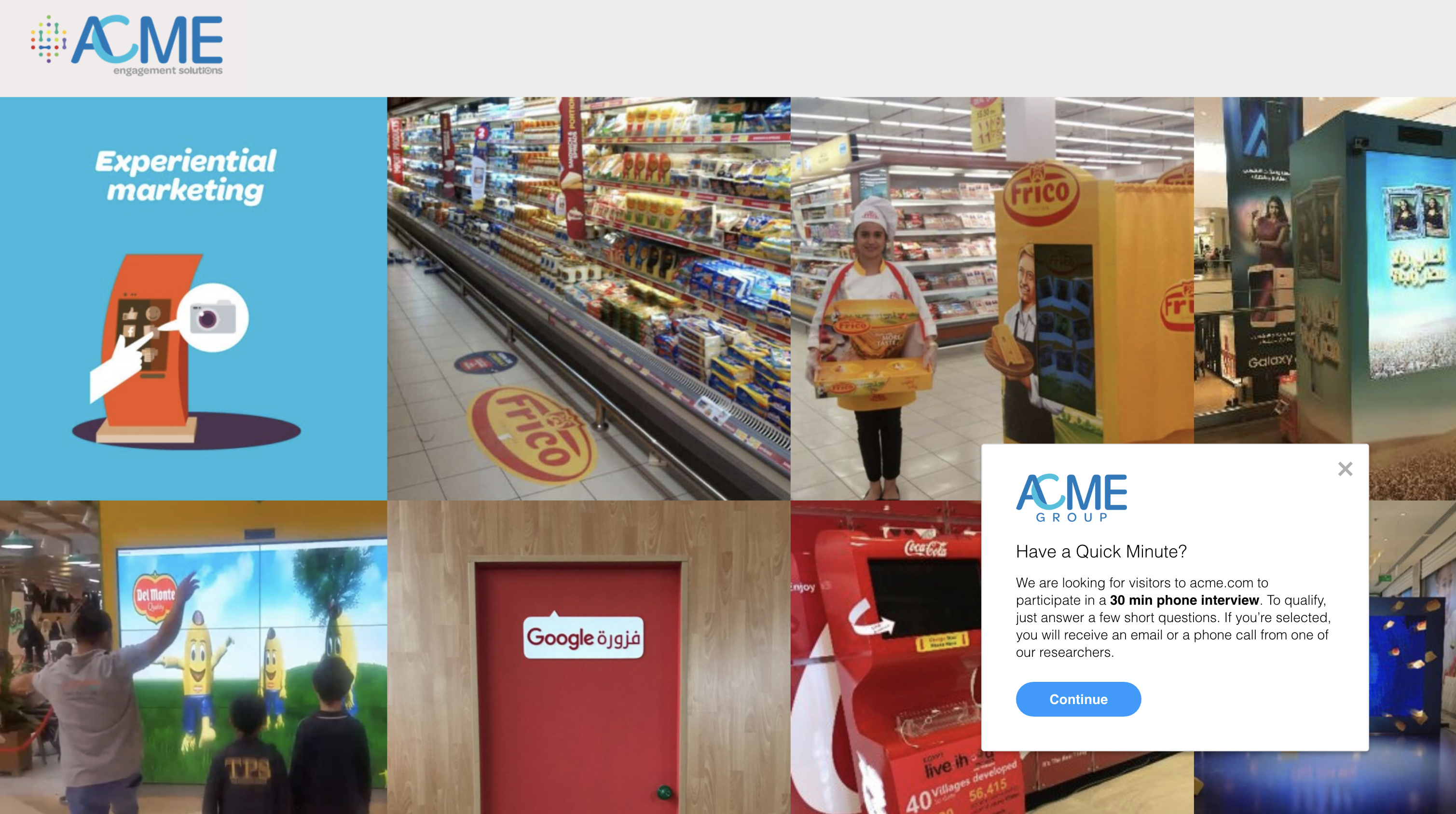
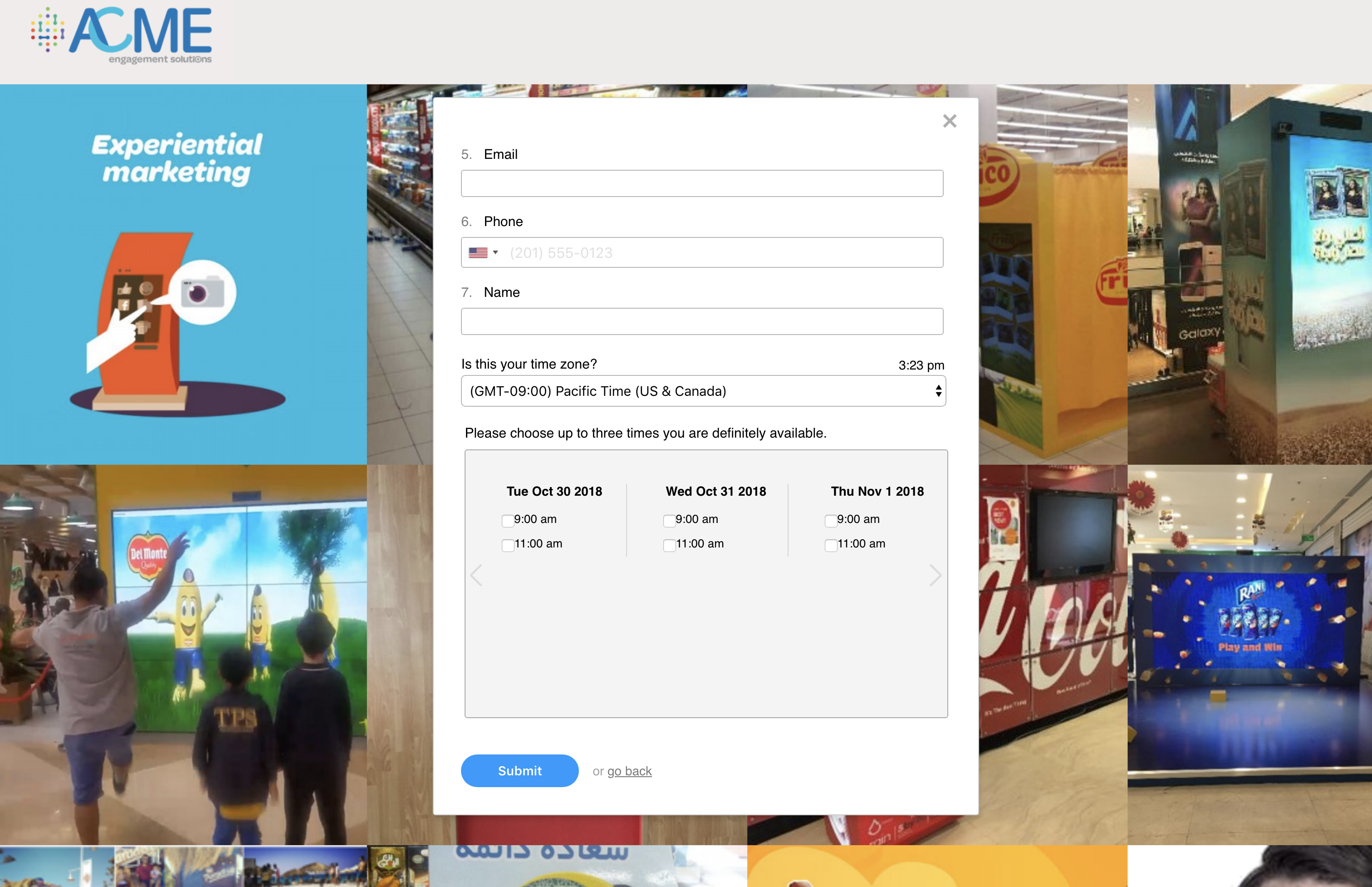
There's a concept in UX of progressive disclosure that applies closely to screener design. Start with the easiest questions, and start with shorter pages. End with more complex questions and collect contact information and scheduling options at the very end. Keep in mind all these best practices apply to links, native app intercepts, and web intercepts. We’re showing screenshots of web intercepts, but the progression would look very similar as a link or native app.
Step 1: Invite – To ask or not to ask
The main decision to make here is if you want a branded invite page with a continue button OR if you want to start with a simple question to begin gathering data immediately.
Number of questions: 0-1 per page. This is where you might want to simply ask people to continue if they’re interested, which is a standard invite (Option 1 below) or ask a qualifying question right away (Option 2 below).
Option 1: Standard Web Intercept Invite
Option 1 is great if you’re targeting new users or an audience that might need more of an introduction to your brand. You can add information about what the interview and incentive rewards.
Option 2: Dive right into a question
This might have higher engagement for some brands or intercepts, but it’s entirely dependent on your context. You can change these dynamically in Ethnio at any time, so feel free to play around with both options on the fly. Even if you start with a question, you can insert a formatted text block to add some more context about the study:
Step 2: Questions
You always want to start with qualifying questions, if you have any qualifying criteria. This filters qualifying users into the next steps, while filtering out unqualified candidates. You can only do multiple pages of questions and qualifying questions in Ethnio with the newer Multi-Page theme.
Number of questions: 2-4 per page. You can have as many pages as you’d like, but try to keep each page above the fold. That generally means only a few questions, depending on radio buttons and checkboxes, which can take up more room.
The main goal is to balance your screening needs with response rate. If you have tons of respondents, you can ask more screener questions.
Step 3: Scheduling
This should almost always be your last page. You gather contact information at the end so that respondents are already invested in completing the screener, and they have a sense of what was asked of them. It’s basically like saving the most sensitive questions for the end. This is also where only qualified respondents can see the scheduling question.
Number of questions: 3-4 max. It should just be email, phone, name, and scheduling.
Keep it Progressive and Critical
Remember, the screener experience should flow from simple to complex. Allow your user to easily digest and process the information you are showing them. Keep your users focused by following these best practices and happy researching!


